Description
Role
Date
Crafting a Seamless Design System.
Product Designer
February 2023
Meet Jarvis!
A documentation on how we built, migrate, and iterate upon Roger’s Design System, Jarvis; a cross-platform design system that gives designers and developers the frameworks they need to create engaging products.
The main objective
The design system team migrated the system from Sketch to Figma while maintaining its core components and implementing a governance and documentation framework to ensure consistency and clarity in design decisions and implementation.
In this case study, I want to delve into the best practices we employed in developing Roger’s Design System. Near the end, I’ll also share some useful tips and tricks that contribute to our current efficient maintenance strategies.
Phase 1
We revisited our design in Figma and questioned layout, hierarchy, and naming conventions. Establishing a robust foundation within the system ensured uniform application and empowered us to confidently expand our library maintenance team.
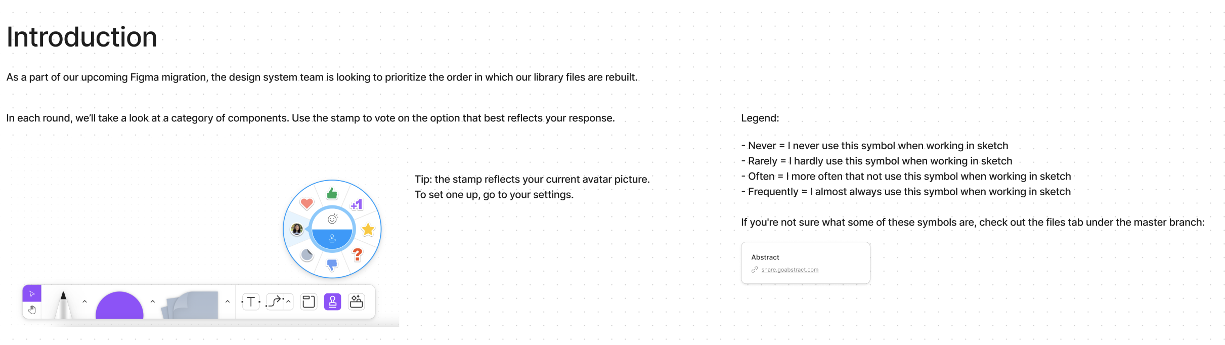
Onboarding on Figma
We systematically promoted the migration by:
A kick-off presentation where we shared Figma tutorials and the anticipated benefits of the migration for all stakeholders
Involving product managers and engineers in the conversation early in the procurement phase through bi-weekly meetings and workshops to strategize how to migrate effectively without interfering with their day-to-day work
Sharing with the squads work in progress and the roadmap of the project
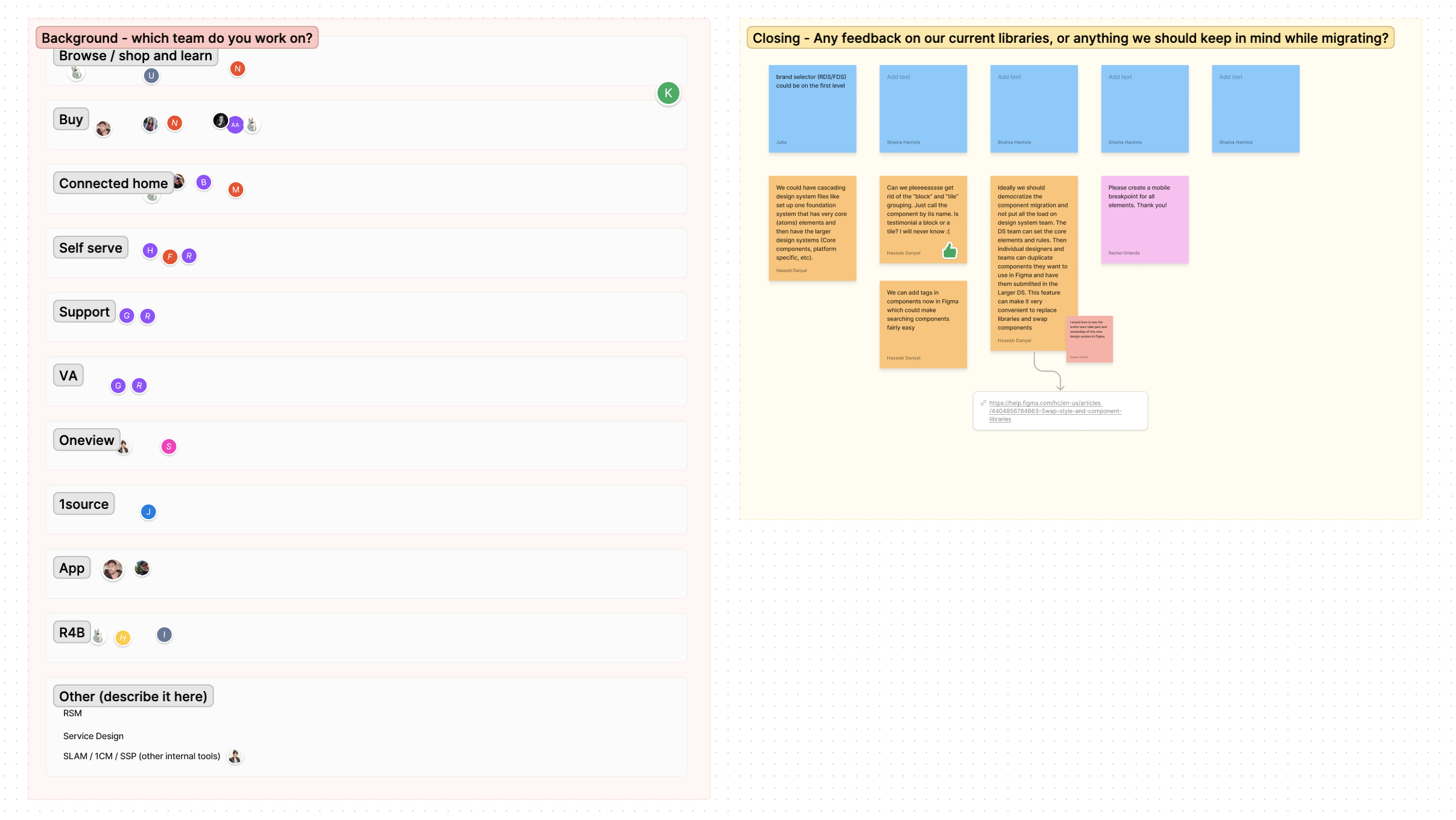
Inventory
We carefully checked all our design elements, involving every designer in a group session. We looked at how our components were used. We identified a lot of inconsistencies in our used cases, which pushed the team forward to have a more systematic approach to our documentation and guidelines for when we finish building out all of our foundation and components.

Phase 2
Foundations
Before Figma, Jarvis was a fairly mature design system, so laying the foundations was one of the simpler tasks. However, we discovered an opportunity.💡
Our colour scheme was only in hex colours without any clear usage guidelines. Many designers were lost when choosing a colour and were using our different shades of red without any direction. The concept of semantic colours was quickly prioritized first before any sort of component building.
We collaborated with the product manager and developers to device the best naming convention.
“Semantic naming in UX design means using clear and meaningful names for things, making it easy for everyone involved (designers and developers) to understand and use them consistently.”
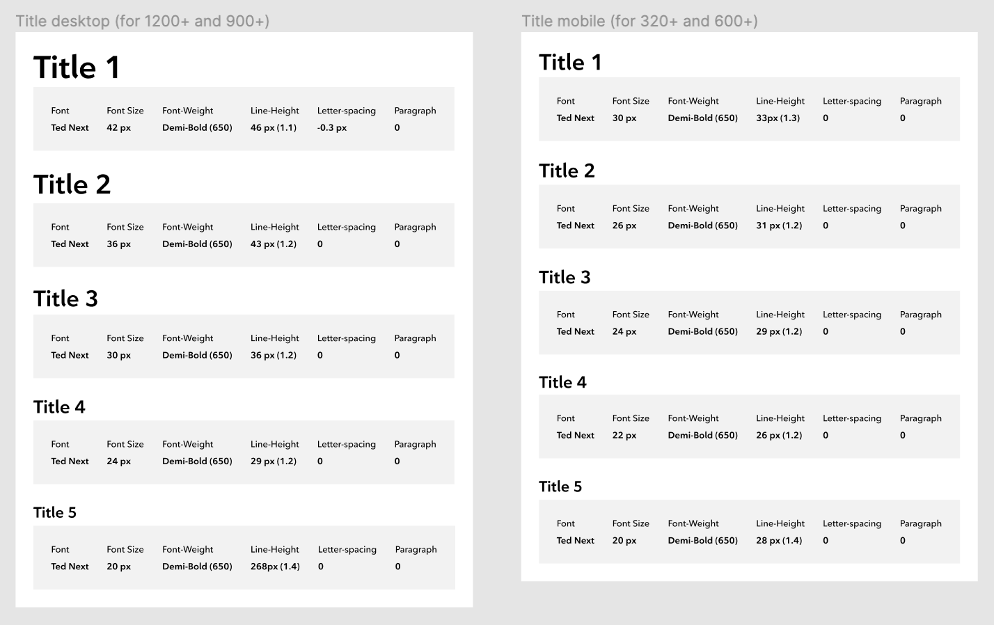
This is how we readapted the typography and colour naming based on the semantic approach:
Creating the components
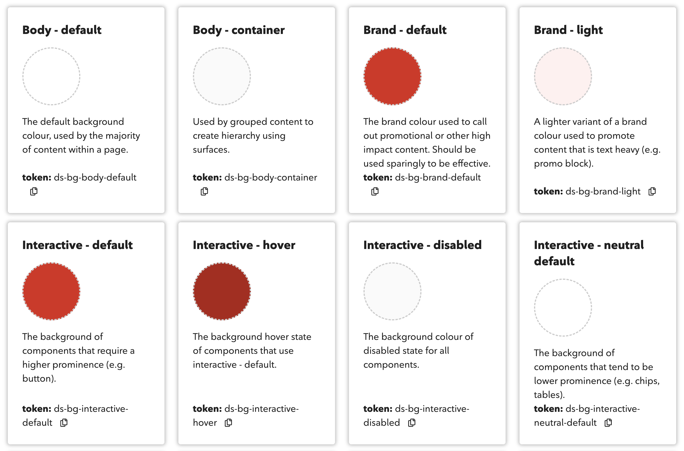
In our system, its named like this “token: ds-bg-interactive-disabled”
As a result, it removed all the guesswork for both designers and developers on what colour to use, as the visual language directly convey the design decision.
We had to rebuild all our components from scratch in Figma, ensuring the incorporation of all necessary properties and variants for our designers.
Must haves:
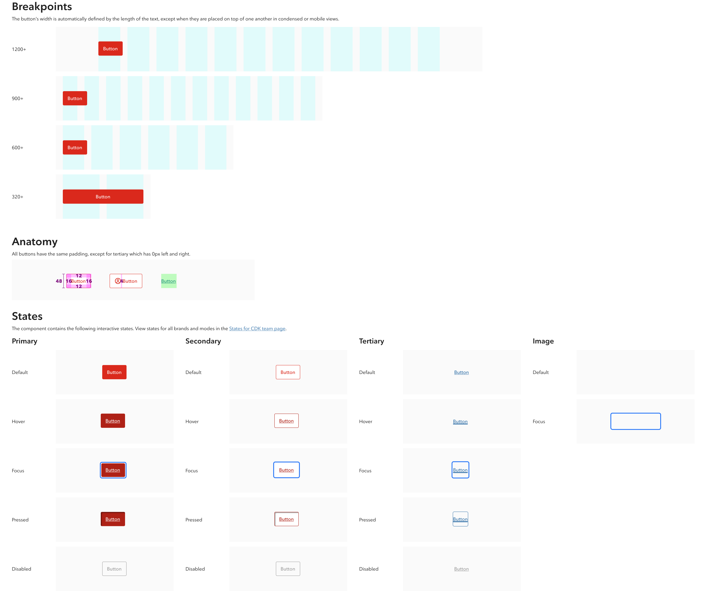
Our components must be responsive with auto-layout Figma features (1200+, 900+, 600+, 320+), so we can easily reuse those components for different layouts for developer hand-off
Our components must be available for all companies under the Rogers umbrella (Rogers, Fido, and Chatr)
Red-lining must be done for each component
We use the variant feature to its full advantage and combine variants into component sets with customer properties and values. Using variants makes components easier to maintain, browse, or swap through the right-side menu.
Phase 3
Documentation
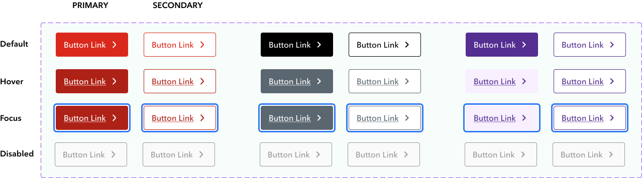
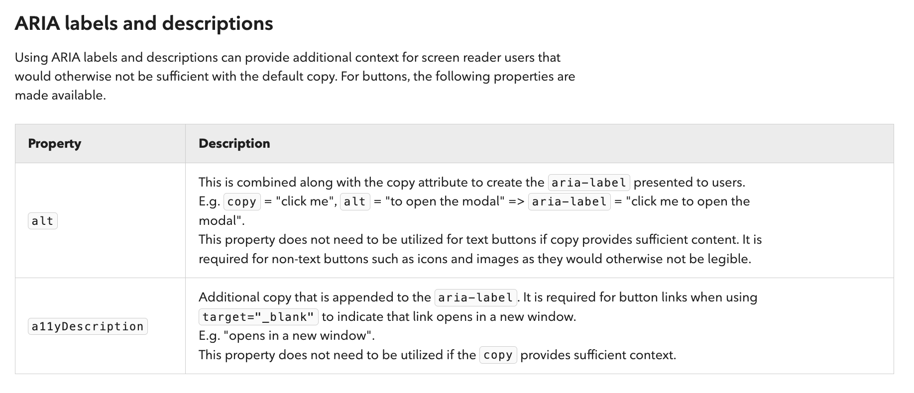
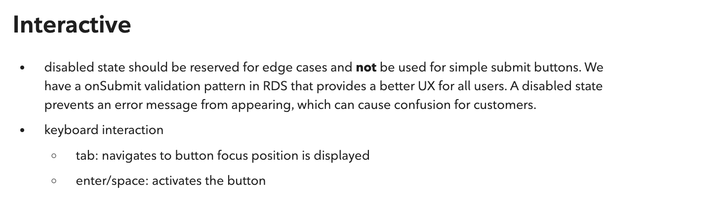
Description of the component
Component anatomy and states
Live examples
Usage guidelines
Accessibility guidelines
Description of the component
Component anatomy and states
Live examples
With components comes with high-quality component documentation. We have different lines of businesses that operationally run differently, so it was important for us to create global guidelines for all.
We referred to many matured leading design systems such as SalesForce, Atlassian, and Polaris for practices we could apply to Jarvis. Our design system is built through Confluence, we created detailed documentation that would support our design system. Our documentation includes:

Usage guidelines
Accessibility Guidelines

Governance
Phase 4
After we started to focus on implementing governance measures to ensure a structured and coherent approach to design while maintaing flexibility and creativity within our components.
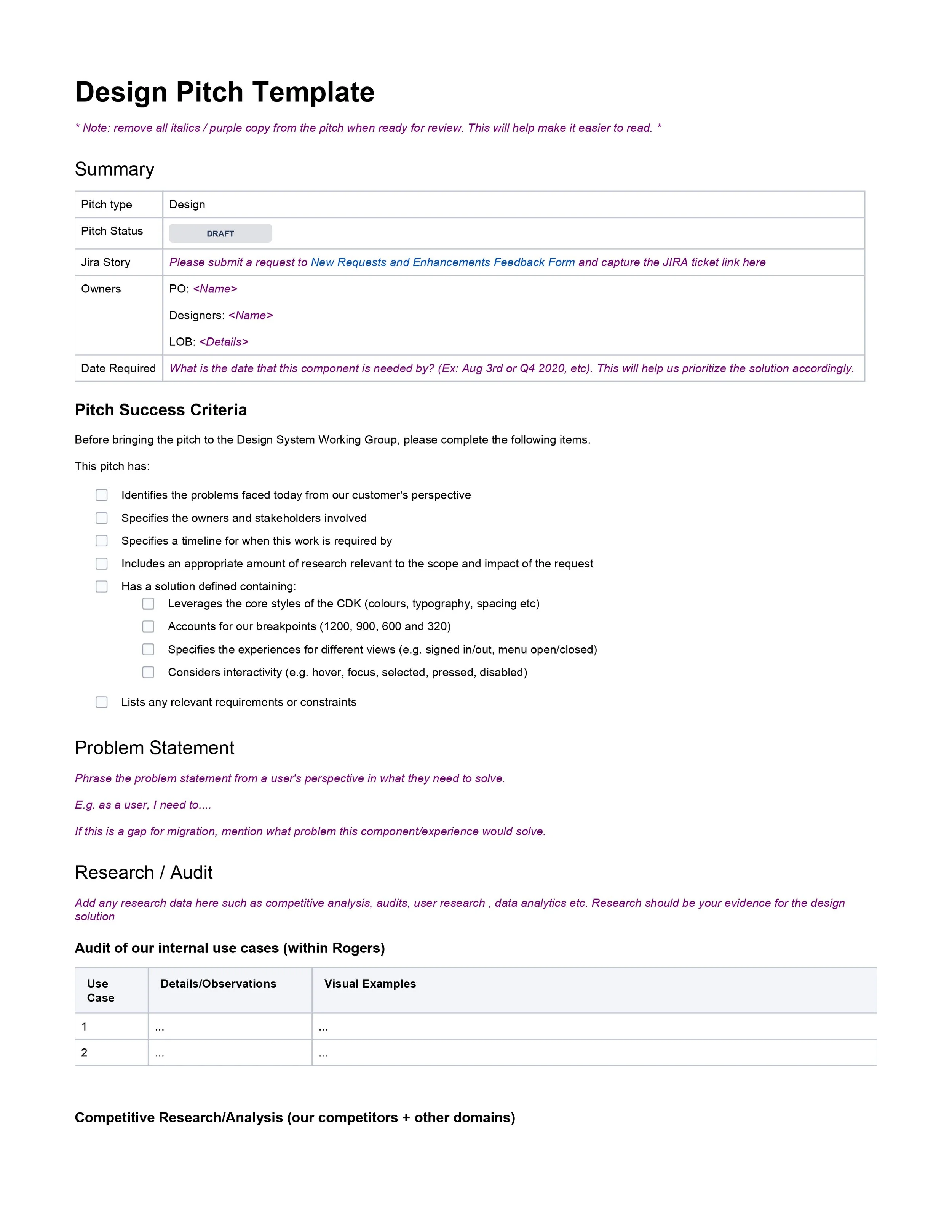
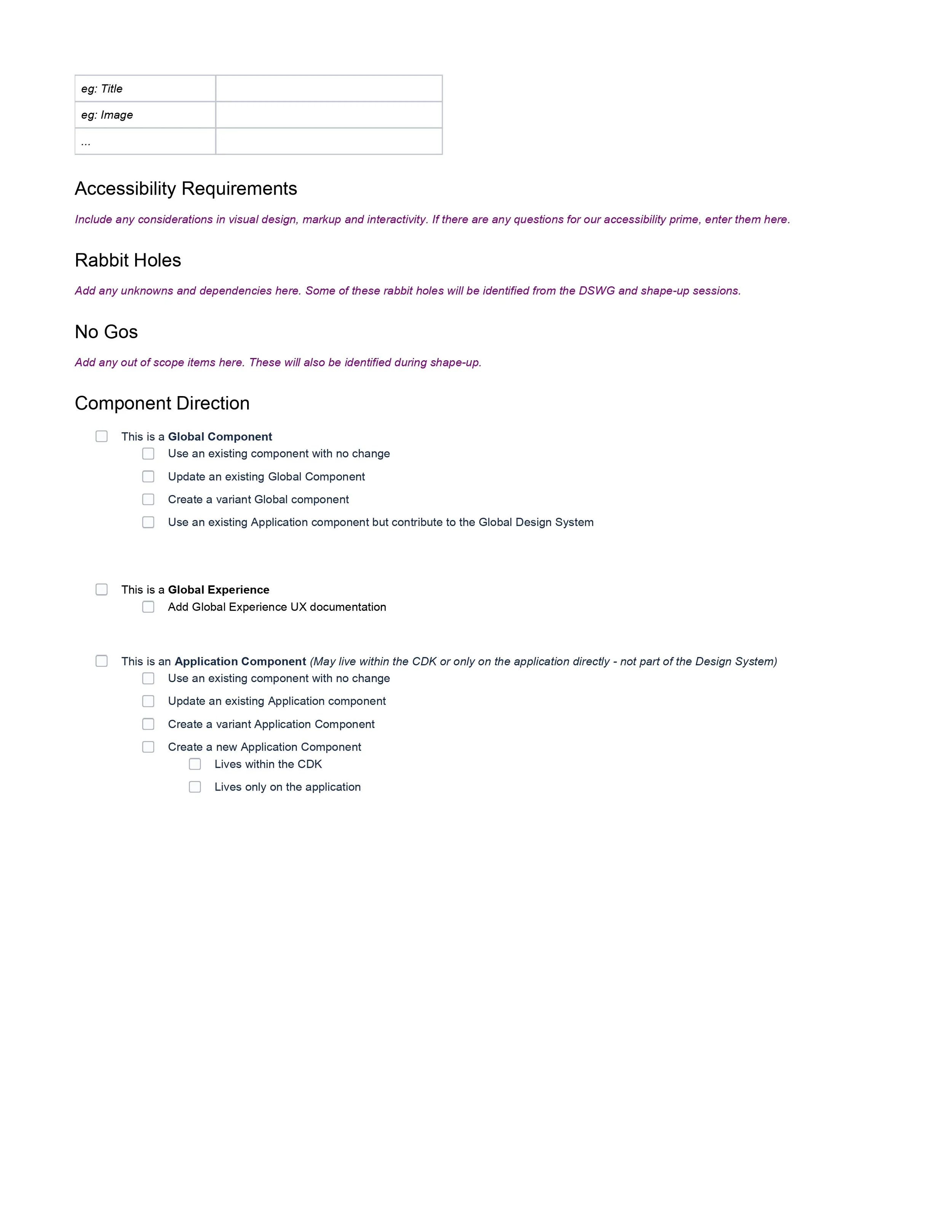
To achieve this, we establish a comprehensive pitch process for all teams involved in design.
When designers are looking to add or enhance a component, they must submit a pitch, providing a structured way to address the problem, present, research, and propose solutions, including visual or UX changes.
The pitch process serves as a collaboration gateway, and after submission, the Design System team, consisting of designers, a product manager, developers, and a content lead, evaluates the proposal for scalability, feasibility, and potential blockers. This structured approach ensures thorough evaluation, leading to seamless and cohesive implementation of valuable improvements across the design system.
Pitch Process:

The future
Jarvis is an ongoing design system, We iterate, change and learn in the process. So far, we have rebuilt our foundations, icons, components, and patterns in Figma which has been a game-changing for our team in terms of efficiency, as well as consistency, and standardization.
The team’s next step includes:
Continuing to enhance our component library and supplement it with better solutions
Add in variables to promote efficiency in all the teams
Cultivating processes and best practices for maintaining the documentation to ensure that our library stays up to date and in sync both design and code
Raising awareness to promote adoption